Adding Tables and Graphs to a Feedback Report

Before tables or graphs can be added to your feedback reports, a RizePoint
engineer must first place the appropriate query in your database. Contact
your RizePoint representative for information on adding a query.
 |
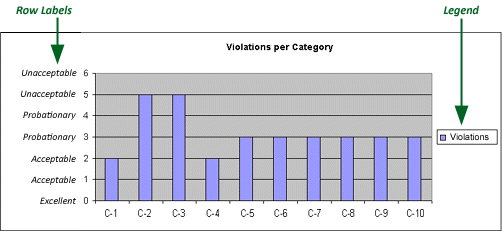
When planning a graph, please note that the
maximum number of characters allowed in the row labels is 18 to
20. If you're graph contains a legend, the row label may contain
up to 18 characters. If you're not using a legend, the maximum
number of characters allowed in the row label is 20. The actual
labels are not defined here; you will provide that information
to RizePoint. This information is provided here merely to assist
you in planning the graph layout. |
Once the query has been added, you can create a configuration that includes
colorful Microsoft® Excel tables or graphs.
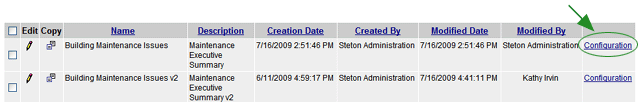
- Go to Reports > Report Setup > Create Feedback Report.
- Create a new configuration file, or click the CONFIGURATION link
to edit an existing configuration.
- Scroll down to locate the Graph or Table definition fields. Note
that these fields are only available if a required query exists. Otherwise,
these fields will be dimmed and unavailable.
- Configure the graph or table as desired. Note that colors used
in graphs are selected by the system. However, you may specify the
colors to use in tables.
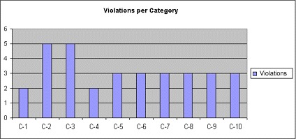
GRAPHS
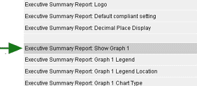
- Make sure the SHOW GRAPH box is checked.
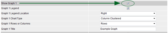
- If you want the graph to include a legend, check the LEGEND
checkbox.
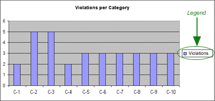
- Indicate where you want the legend positioned on the graph.
- Select the type of graph to use. (NOTE: Make sure that the
data included in the
report is suited to the particular type of graph you are using.)
- Select to use ROWS or COLUMNS. (If the graph does not display
as expected, you may need to switch from Rows to Columns, or from
Columns to Rows.)

- Enter the title that you want to appear above the graph.
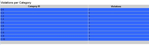
TABLES
- Check the SHOW TABLE box.
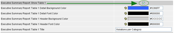
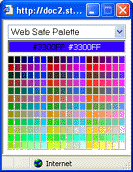
- Click the Color Palette icon beside each field to display a
color selection window.
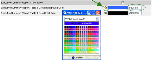
- Click on a color to select it. Note that several palette types
are available. You may select a different palette from the droplist.
- Enter the title of this table.
- Click the OK button.
When you view a report that has been assigned this configuration, the
specified graphics and/or tables are included.