
As you add or remove search criteria in the search bar, the visual representation of the data loads or updates in the visualization display in real time. SDA automatically selects grids or charts that it determines are the best visualization choice for the search results. An SDA Creator can always change the visual display to a different, available format.
Navigate to REPORTS > SEARCH-DRIVEN ANALYTICS and conduct a search.
As you define a search, SDA will suggest the best visualization
for the search results.
In the example below, the search shown here resulted in a scatter diagram
of scores and counts. Outliers are easily visible as are the clustered
patterns. Hovering over the data points displays tooltip details of
the Location ID, specific count and average score.
To change the visualization, click the CHANGE VISUALIZATION icon. All
of the available visualization options for the data will display in
the options pane to the right.
![]()
Hover over the visualization option that you would like to use
and click the icon.
![]()
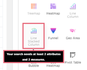
Notice
that if a visualization icon is not available for the search
results, the icon will grayed out and will not be active.
Hover over the icon to view a description of what is needed
in the results to be able to use that particular visualization
format. |
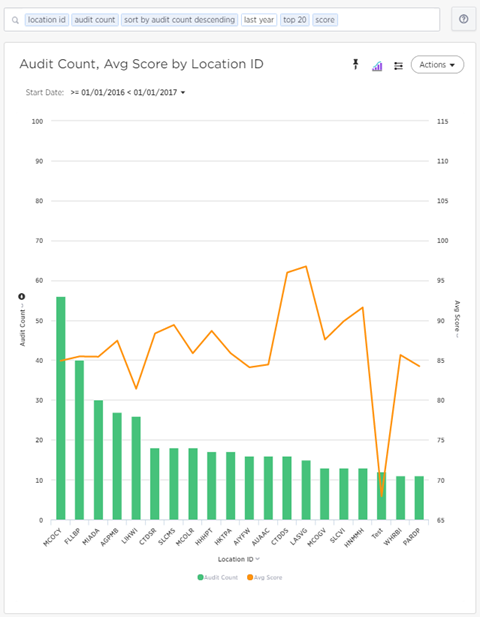
View the newly created visualization. In this example, the scatter
diagram above was changed to a Line Column display. The chart displays
the Location IDs sorted in descending order of audits performed. The
line displays the average scores at each location.

